Analytical Skills
When we revised our first draft and transformed it into the final report, we encountered two problems - How would we provide a desirable result to our client, and How could we summarise our findings into a 2,000-word report?
Research
The first problem arose from our limited resources in accessing the venture capital’s criteria. Our research was mainly based on the secondary resources we could access online. It included the university’s libraries, other VCs’ information databases, and venture capital websites. I discovered the VC funding trends, VC’s interest, and other basic information about VC by analysing these resources. To obtain VC’s specific criteria, we contacted the VCs interested in technology companies through e-mails and LinkedIn and attached our questionnaire. Although the reply rate was not optimistic, our lecturer Gaia recognised our initiative and efforts to try.

Our Mentor JJ’s Feedback
Data Visualisation
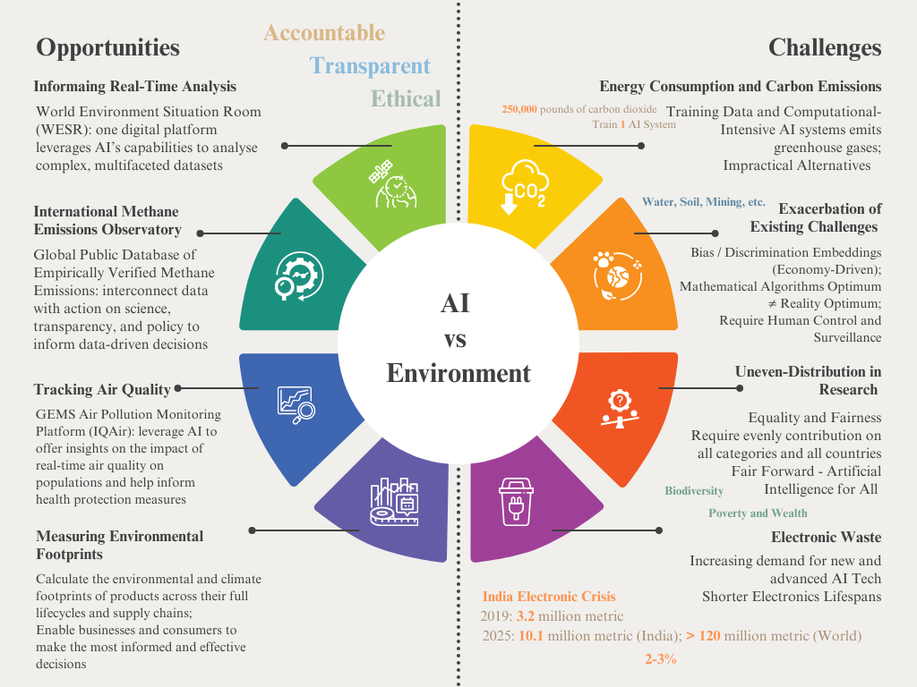
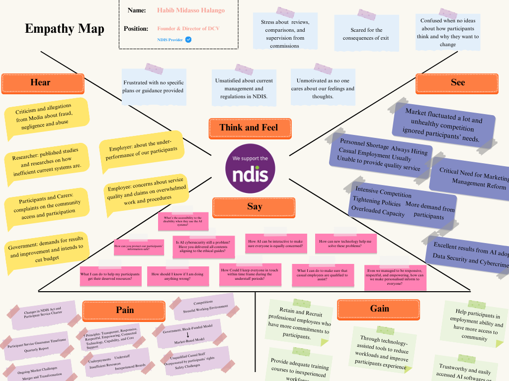
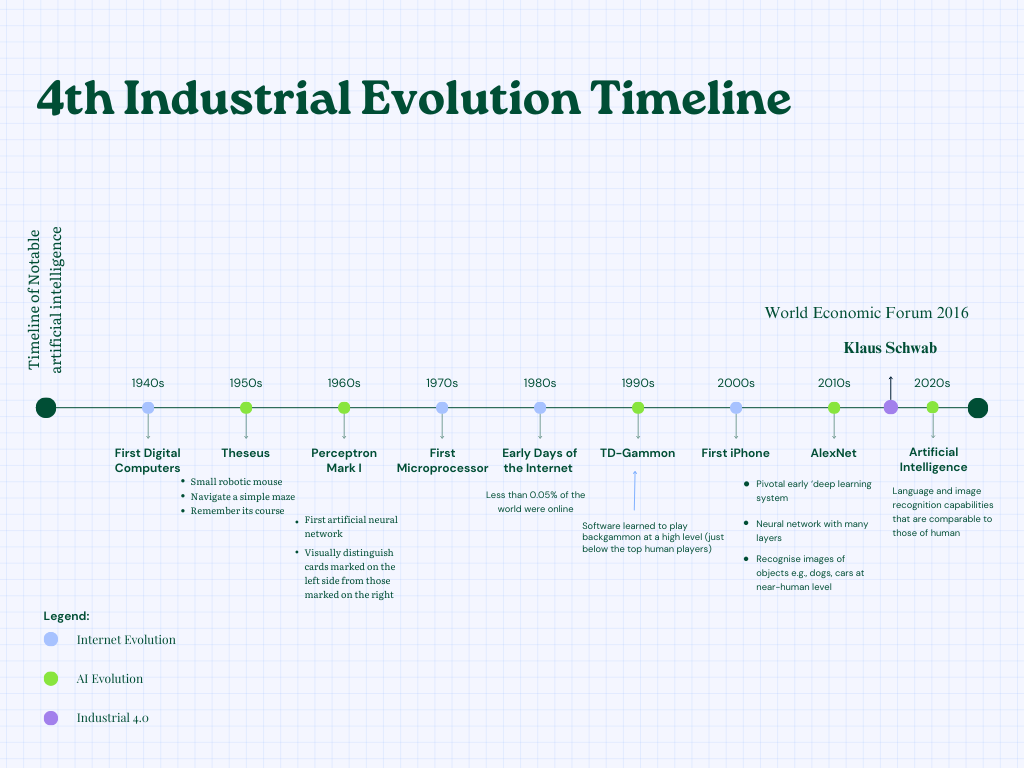
The second problem was about the communication and delivery mode. Our findings consisted of a wide range of raw data and analysis. It’s impossible to summarise them into 2,000 words without missing a point. I decided to use infographics to replace overwhelmed data inputs and prolonged analysis.
My process was to:
Organised and categorised raw data: removed and merged similar data
Determined the purpose of each category: comparison, trending, composition, or relationship
Found suitable charts to present the data
Highlighted the key points for each chart
Put all the related charts on one page
Set a topic/ theme for each page
Used the storyboard to help with the layout
Summarised the overall opinion on each topic
With the proper use of infographics, I managed to put more than 80% of our data and analysis into the report and increased the readability of our report.